 vido
vido- Posts : 2
Join date : 2019-04-09
 Recent Render
Thu Nov 21, 2019 3:43 pm
Afternoon People,
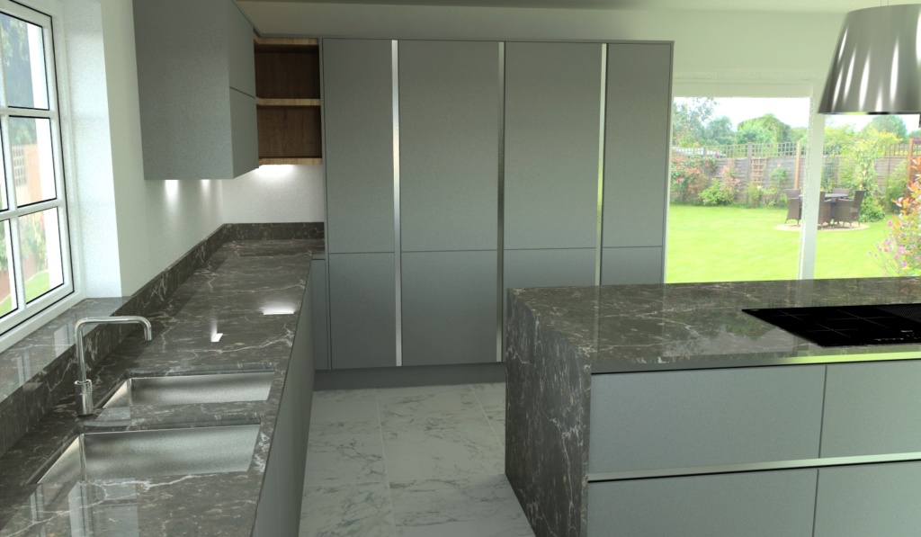
First time poster on here, help or suggestions would be great. I've attached an image of a kitchen I recently rendered.
this was on Articad highest options but still don't seem very clear or as sharp as most I see on here. Just wondering what can be done to improve this.
thanks in advance.
First time poster on here, help or suggestions would be great. I've attached an image of a kitchen I recently rendered.
this was on Articad highest options but still don't seem very clear or as sharp as most I see on here. Just wondering what can be done to improve this.
thanks in advance.
- Attachments
 Re: Recent Render
Thu Nov 21, 2019 4:08 pm
Welcome to KBB CAD vido!
The only suggestion I'd make is to reduce the diffuse on the window view, as it's creating a lot of noise, the rest of the image looks fine - matt neutral colours never really "pop out" at you, unless you change the wall colour to something contrasting.
I've attached an image of one I've done recently, where I spent time getting the window views to be less bright. You'll notice I also suffer from "floating accessories syndrome"

 vido
vido- Posts : 2
Join date : 2019-04-09
 Re: Recent Render
Thu Nov 21, 2019 4:19 pm
Hi Michael,
floating syndrome, like it thanks for your advice, I will give it ago. I'm new to Articad
and pretty much self taught, so little bit behind what you can all produce
floating syndrome, like it
and pretty much self taught, so little bit behind what you can all produce
Permissions in this forum:
You cannot reply to topics in this forum