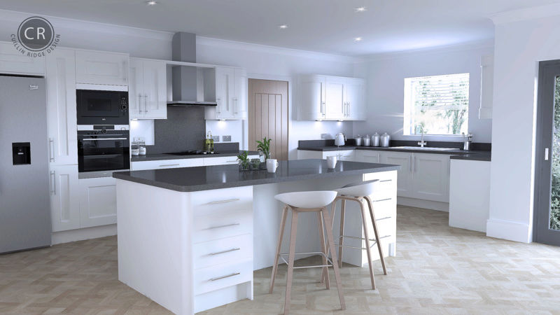
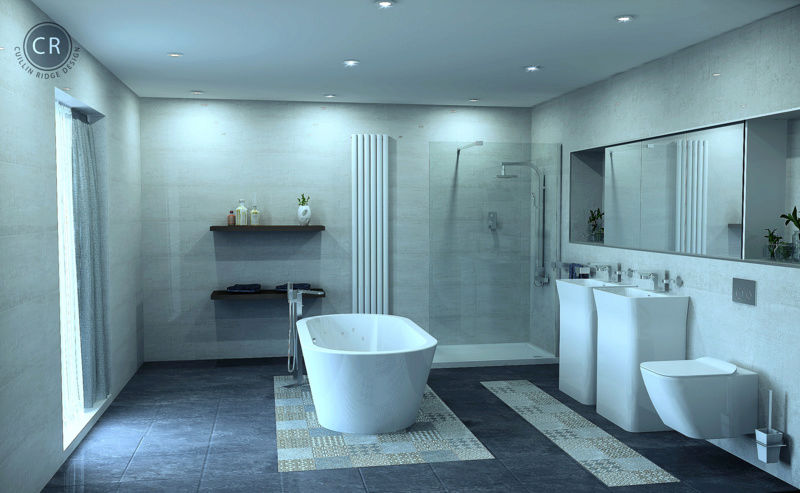
Kitchen and Bathroom
+2
Darrel
Joe
6 posters
 Re: Kitchen and Bathroom
Wed Jan 31, 2018 9:14 am
Superb work as always, I think you should be re-evaluating your prices!
 Re: Kitchen and Bathroom
Wed Jan 31, 2018 2:55 pm
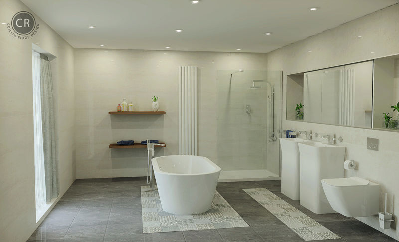
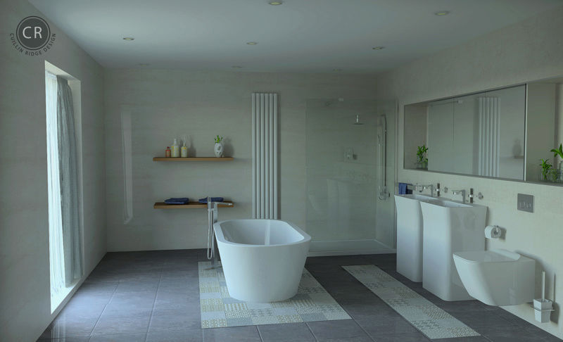
Quick update, tried my normal editing which gives the render a bit warmer look. Then turned off the internal spots and used just lit appearance in window to do a daylight shot. No sun or editing on last image. Think we can over do it with spotlights, most of the time i prefer keeping them off to get a more natural and correct coloured render!


 Re: Kitchen and Bathroom
Wed Jan 31, 2018 4:36 pm
Always like your work. I'm not colourist so I think both options look great! 
 Mingerz
- Posts : 218
Join date : 2017-11-06
 Re: Kitchen and Bathroom
Thu Feb 01, 2018 1:53 am
Both are fabulous renders but the one with lighting, to me at any rate , looks more cosy. I guess, if realism was the be all and end all, Photoshop would go out of business..lol
 Re: Kitchen and Bathroom
Thu Feb 01, 2018 9:08 am
How did you do the patterned tiles joe? Just a floor board set a couple of mm off the floor? I think I actually prefer the lit one too, agree with mingerz, looks a little more cosy and inviting. both fab though!
 Re: Kitchen and Bathroom
Thu Feb 01, 2018 10:28 am
Jayne, yes.
Guys if anyone edits in photoshop download Google Nik Collection add-on. It's free from here: https://www.google.com/nikcollection/ Just your email address req and they send you a download link. Just for getting rid of noise in images it's so worth it. Will leave a link for a youtube video so you can see what it does. https://www.youtube.com/watch?v=gikVjBnpTRQ
Guys if anyone edits in photoshop download Google Nik Collection add-on. It's free from here: https://www.google.com/nikcollection/ Just your email address req and they send you a download link. Just for getting rid of noise in images it's so worth it. Will leave a link for a youtube video so you can see what it does. https://www.youtube.com/watch?v=gikVjBnpTRQ
Permissions in this forum:
You cannot reply to topics in this forum