 Stejoke
- Posts : 38
Join date : 2017-11-19
 So many questions!
Sat Mar 17, 2018 5:06 pm
Hi all
First post on this forum, but been on KFF for a while now.
Firstly, I cannot believe the difference between the renders you produce and mine...! So love to get better, but slightly hesitant as I struggle to follow a lot of what you're saying, let alone apply it!
I did the level 1 Articad course with Charles last year and have been happily cracking on. The business is just me designing, supplying and installing, so there is never much time to focus on improving renders! But I want to make time!
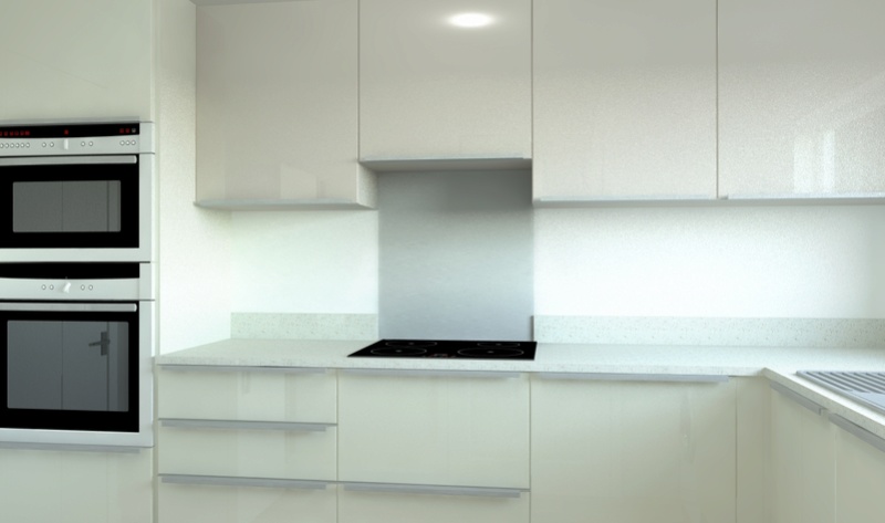
Attached is a very simple utility drawn to the customer's spec - it's nothing special, but I want to focus on what I need to do to make it look more realistic.
It is all Articad preloaded items and settings except:
- the worktops are Mistral, so I saved an image from the internet for these and used that as the textures
- I used Daz's advanced material settings for the doors, walls, and sink
- I've used Joe's settings to set the sunlight to softer
The black windows on the left should be black as they're into a boiler room.
As you can imagine, I have many questions.... But if you could please let me know a couple of next steps for me that would be very helpful!
Thank you
Steve
- Attachments
 Re: So many questions!
Sat Mar 17, 2018 5:21 pm
Welcome Steve
A few points:
1. The Glass Material... have you altered that to match real glass.... An average window pane transparency is about 87% . Drop the Transparency in the advanced tab to 0.87. This helps out a little with Tone Mapping.
2. The Black Boiler room window... gives the impression it is letting skylight in. If that room does not have a window to let daylight in then it would be better to use a different graphic. Using windows will always have a Portal which forces the render engine to concentrate sampling at these openings.... a bit of a no, no even if you try to block it as it can cause a lot of noise in the render.
3. The Worktop looks to reflective for Mistral as the window reflection is to sharp.... What are your advanced settings for this material?
4. Would look nicer to get a lit appearance view on the window... If you have a "square on" photo of the window it is even better as it will add a lot to the realism as the colours will be picked up in the reflections... the customers are usually impressed also doing this...
 Re: So many questions!
Sat Mar 17, 2018 10:28 pm
Welcome Steve, It can be hard trying to learn and understand more advance settings when time is a factor and designing is just part of the day job.
As Daz said i would first concentrate on lighting and window views with lit appearance. There are a number of posts on here and on the kff for this including the fantastic daz lighting calculator.
You will find v21 will be a big improvement with out of the box material settings giving you better results quicker on that side!
Hopefully articad will also bring out some comprehensive videos with it as v20 had basically just a couple of webinars. Especially for the new material editor and some better lighting tips.
Any questions just ask.
 Stejoke
- Posts : 38
Join date : 2017-11-19
 Re: So many questions!
Mon Mar 19, 2018 8:42 pm
Cheers Daz & Joe
Daz on your points:
1 - great thank you
2 - what do you mean by a different graphic please? There is actually a window there, but it's just into a dark room
3 - I have diffuse: 0.9; specular: 0.06; glossiness 0; fresnel 1 (all default of a low gloss preset unchanged)
4 - thank you. I have just read a post on window views on the KFF. Makes sense. But unsure where the view comes from in the first place. Is it literally a photo I take when I go round, or are you using standard images from somewhere?
Joe on yours!:
Thank you - I've looked at Daz's lighting calculator; it looks very impressive, but I need a bit more time to understand it I think!
Has version 21 been given a launch date do you know?
I'll keep posting and asking!
Thanks
Steve
 Re: So many questions!
Tue Mar 20, 2018 8:36 am
Steve, hearing it's the end of the month or start of April! Click on a window there should be an option to have a view (VIEW 2 for example.)
You can change the default image to something better or your own, Large size images are best.
Also check the option for world. This will stretch the image if you have multiple windows on the same run giving you a more realistic view from all windows.
You can change the default image to something better or your own, Large size images are best.
Also check the option for world. This will stretch the image if you have multiple windows on the same run giving you a more realistic view from all windows.
 Stejoke
- Posts : 38
Join date : 2017-11-19
 Re: So many questions!
Tue Mar 20, 2018 6:53 pm
Thanks very much Joe
Look forward to seeing v21!
Look forward to seeing v21!
 Stejoke
- Posts : 38
Join date : 2017-11-19
 Re: So many questions!
Wed Mar 21, 2018 2:05 pm
Hi all
I've played with the views on the windows, but can't see an option to replace the image. I tried changing the colour of the glass to a photo uploaded in the textures. But no joy. What am I not doing / doing wrong!?
Thanks
Steve
I've played with the views on the windows, but can't see an option to replace the image. I tried changing the colour of the glass to a photo uploaded in the textures. But no joy. What am I not doing / doing wrong!?
Thanks
Steve
 Re: So many questions!
Wed Mar 21, 2018 2:57 pm
Steve,
keep the glass as glass. If you have selected view 2 in the window then go to the material settings and look for view 2 and then change the image.
keep the glass as glass. If you have selected view 2 in the window then go to the material settings and look for view 2 and then change the image.
 Stejoke
- Posts : 38
Join date : 2017-11-19
 Re: So many questions!
Wed Mar 21, 2018 3:00 pm
Ah - I see!
Thank you Joe
Thank you Joe
 Stejoke
- Posts : 38
Join date : 2017-11-19
 Re: So many questions!
Wed Mar 21, 2018 5:11 pm
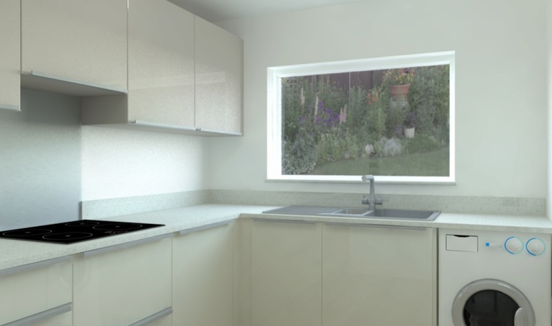
I've produced my first render with a window view! - thank you for your help.
Would appreciate your advice on the next steps please! Specifically:
- the colours on it look too vivid - how do I dull it down?
- around the edges of the window it looks really bright - the only advance setting I've changed is the diffuse to about 2, on the view
- is there a way to choose what part of a view you look at and at what angle?
Thanks again
Steve
- Attachments
 Re: So many questions!
Wed Mar 21, 2018 6:41 pm
Steve, nice renders.
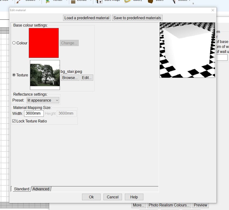
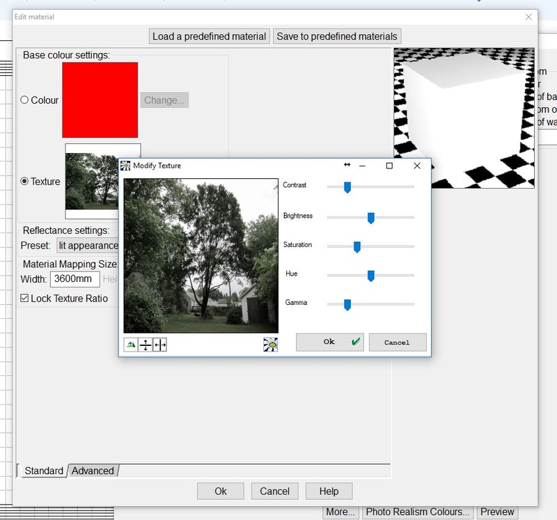
Ok go to your view 2 material and click edit then simply move the saturation slider to dull the colours down. Also make sure the view is set at lit appearance image 1. The diffuse setting in the advance settings controls the light produced by the lit appearance so a higher value will produce more light.
Hope this helps.


 Re: So many questions!
Thu Mar 22, 2018 8:37 am
Steve, i would have expected Articad to have went over this with you in level one training as window views seriously help with realism and are pretty straight forward to do once you know how. I would phone them up and ask why it wasn't covered in level 1 training and ask what other advice they can give you to help you out. Training is expensive, you want to make sure you got the whole experience out of it 
 Stejoke
- Posts : 38
Join date : 2017-11-19
 Re: So many questions!
Fri Mar 23, 2018 9:27 am
Thank you both. Will try that now Joe
Yes the training is pretty expensive Jayne. That, and not being sure I would get a lot of benefit from it is what puts me off doing more. I'd be happy to go if I knew a focussed day would really improve the renders
Yes the training is pretty expensive Jayne. That, and not being sure I would get a lot of benefit from it is what puts me off doing more. I'd be happy to go if I knew a focussed day would really improve the renders
 Re: So many questions!
Fri Mar 23, 2018 2:34 pm
Looking good Steve,
Next stage is making anything chrome or st/steel. Like the oven, handles, sink and tap. This will help your renders pop more!
Also ditch the room light or turn it down from 100 to zero! You don't need it. Downlights are better. Just make the lens of the downlight lit appearance!

Next stage is making anything chrome or st/steel. Like the oven, handles, sink and tap. This will help your renders pop more!
Also ditch the room light or turn it down from 100 to zero! You don't need it. Downlights are better. Just make the lens of the downlight lit appearance!
 Stejoke
- Posts : 38
Join date : 2017-11-19
 Re: So many questions!
Sat Mar 24, 2018 8:47 am
Thank you Joe!
Permissions in this forum:
You cannot reply to topics in this forum