Page 2 of 2 •  1, 2
1, 2
 1, 2
1, 2 Re: Door colours don't seem right!
Sat Mar 03, 2018 1:44 pm
magga wrote:That’s fair enough Daz, I realise how busy we all can be!
Just about a year now, no previous CAD experience though and not had time to go on the articad training either.
Most of my designs turn out okay, it’s just non gloss ones that never come out as good! Interested to see how you’ve done the window as it appears you’ve spanned the same image across the 2 windows, which makes sense in the real world!
Thanks
Views for outside view are best set to World Mapping and use a seamless image like I have used which I just mirrored the same photo.
 Re: Door colours don't seem right!
Sat Mar 03, 2018 8:14 pm
Joe wrote:Finally cleared out my pre defined list for frontals to just 8, all i need is the colour picker for the paint colour R,G,B or wood texture and i'm good to go! Daz material settings are the way to go!Same for walls, ceilings, floors and metals!
Yeah....way to go...
 magga
magga- Posts : 29
Join date : 2018-03-01
Location : Nottingham
 Re: Door colours don't seem right!
Sun Mar 04, 2018 9:44 am
Hi Daz,
Just having a look at this now, it won't let me open the file you created due to an error with the properties, so I can't see the settings you've used
With the view out the window, do you set the material mapping size to that of the image itself?
Thanks
Matt
Just having a look at this now, it won't let me open the file you created due to an error with the properties, so I can't see the settings you've used
With the view out the window, do you set the material mapping size to that of the image itself?
Thanks
Matt
 magga
magga- Posts : 29
Join date : 2018-03-01
Location : Nottingham
 Re: Door colours don't seem right!
Sun Mar 04, 2018 10:06 am
I've just started doing this with mine, where did you get the settings from I've looked for the sheen calculator that Daz used in my render, but can't find it.
Cheers
Matt
 Re: Door colours don't seem right!
Sun Mar 04, 2018 10:32 am
 magga
magga- Posts : 29
Join date : 2018-03-01
Location : Nottingham
 Re: Door colours don't seem right!
Sun Mar 04, 2018 10:37 am
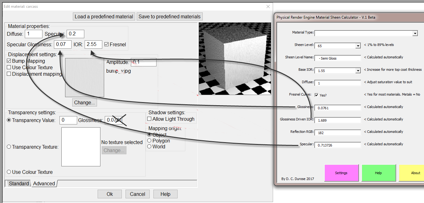
Ahh, thanks. I saw those in there but didn't realise you'd used those for "carcass". Where would you enter the "Reflection RGB" as I don't seem to have that option?
- Attachments
 Re: Door colours don't seem right!
Sun Mar 04, 2018 10:47 am
You will have to use the specular value instead of the rgb
 magga
magga- Posts : 29
Join date : 2018-03-01
Location : Nottingham
 Re: Door colours don't seem right!
Sun Mar 04, 2018 10:55 am
Ok, cheers. So, have I got this right in where these things go...
- Attachments
 Re: Door colours don't seem right!
Sun Mar 04, 2018 12:23 pm
magga wrote:Ok, cheers. So, have I got this right in where these things go...
Matt you are not putting the Glossiness factor in the right place.... ignore the Transparency one...
Watch this video of me explaining where the values go:
 magga
magga- Posts : 29
Join date : 2018-03-01
Location : Nottingham
 Re: Door colours don't seem right!
Sun Mar 04, 2018 12:47 pm
Ah ok thanks Daz, I don't seem to have that section in mine, I think I need to update it maybe?
 Re: Door colours don't seem right!
Sun Mar 04, 2018 1:33 pm
Turning on the Advanced Reflection Options post here on the KFF Forum - http://www.kitchenfittersforum.com/showthread.php?tid=6059&pid=52239#pid52239
 Re: Door colours don't seem right!
Sun Mar 04, 2018 3:08 pm
Daz, honestly, you NEED to go freelance with this, one 2 one training, online, over the phone and in person. You would make such good money, build up amazing contacts and the demand would be incredible! I would sign up for training with you immediately as I know many others would.
 Re: Door colours don't seem right!
Sun Mar 04, 2018 4:14 pm
Jaynehiddleston wrote:Daz, honestly, you NEED to go freelance with this, one 2 one training, online, over the phone and in person. You would make such good money, build up amazing contacts and the demand would be incredible! I would sign up for training with you immediately as I know many others would.
Thanks Jayne and everyone for your encouragements, I really appreciate all your comments and are using the settings and information to improve all your designing and rendering results.
I will and have been giving it some serious thought....
 magga
magga- Posts : 29
Join date : 2018-03-01
Location : Nottingham
 Re: Door colours don't seem right!
Sun Mar 04, 2018 8:47 pm
Hi Daz, okay thank you for that. With the window image set to world, is there a way to move the image within the window? I’m currently getting the middle of the mirrored bit showing right in the centre of the window! Cheers
 Re: Door colours don't seem right!
Sun Mar 04, 2018 9:37 pm
magga wrote:Hi Daz, okay thank you for that. With the window image set to world, is there a way to move the image within the window? I’m currently getting the middle of the mirrored bit showing right in the centre of the window! Cheers
You could select your first wall element and use the "Space" tool using either plus or minus values to move the plan as World mapping starts at the default wall starting point. Select all your graphics and move them after
I turned your plan using the same method to landscape. Select the first wall and use the Turn tool...
See this video:
 magga
magga- Posts : 29
Join date : 2018-03-01
Location : Nottingham
 Re: Door colours don't seem right!
Sun Mar 11, 2018 10:33 am
Sorry for late reply Daz, just come back to this design now. Will give that a go, cheers. Do you happen to have a decent navy/blue metro tile image? I'm currently using the attached but its white and I'm struggling to find a seamless one online.
Cheers for all your help!
Cheers for all your help!
 magga
magga- Posts : 29
Join date : 2018-03-01
Location : Nottingham
 Re: Door colours don't seem right!
Sun Mar 11, 2018 11:25 am
Hi again Daz,
With the window view you used, what did you set the width/height to? I have rotated the plan and tried to use the space tool, I assume this is in tools > wall helper? I am not sure how to get this working, as it just seems to eat into the wall section, rather than move it to the right/left.
See the attached image of what I'm getting on the render with the window views.
Cheers
Matt
- Attachments
 Re: Door colours don't seem right!
Sun Mar 11, 2018 3:02 pm
magga wrote:Sorry for late reply Daz, just come back to this design now. Will give that a go, cheers. Do you happen to have a decent navy/blue metro tile image? I'm currently using the attached but its white and I'm struggling to find a seamless one online.
Cheers for all your help!
Hi Matt
Just created a Sky Blue Texture and Bump Map for for the Metro Tiles HERE
 Re: Door colours don't seem right!
Sun Mar 11, 2018 3:04 pm
magga wrote:Hi again Daz,
With the window view you used, what did you set the width/height to? I have rotated the plan and tried to use the space tool, I assume this is in tools > wall helper? I am not sure how to get this working, as it just seems to eat into the wall section, rather than move it to the right/left.
See the attached image of what I'm getting on the render with the window views.
Cheers
Matt
I sized it to 4795 wide x 2100 high
 magga
magga- Posts : 29
Join date : 2018-03-01
Location : Nottingham
 Re: Door colours don't seem right!
Sun Mar 11, 2018 7:35 pm
Awesome thanks Daz. Still a bit confused by the "world" setting. it looks okay on the door and the first window, but then the image on the 2nd window is much larger, even though all the dimensions are set the same.
I'm doing some renders now anyway and trying to miss the 2nd window out as I've got to present this one tomorrow!
Will post the final result, thanks for all the help!
I'm doing some renders now anyway and trying to miss the 2nd window out as I've got to present this one tomorrow!
Will post the final result, thanks for all the help!
 magga
magga- Posts : 29
Join date : 2018-03-01
Location : Nottingham
 Re: Door colours don't seem right!
Sun Mar 11, 2018 10:48 pm
Ah, I can't actually post them as it says I am out of space!
 magga
magga- Posts : 29
Join date : 2018-03-01
Location : Nottingham
 Re: Door colours don't seem right!
Tue Jun 19, 2018 6:24 pm
Ah I never did get round to posting the final image! I got the job anyway, thanks all for the help!
Page 2 of 2 •  1, 2
1, 2
 1, 2
1, 2Permissions in this forum:
You cannot reply to topics in this forum


